
1Hive Brand Book Chapter Two: Colors & Typography

Introduction
In this update of the 1Hive Brand Book we will talk about the colors that make up the 1Hive ecosystem, as well as their flexibility and use. We will also discuss basic principles of typography that we should keep in mind when using it.
Primary and Secondary Colors
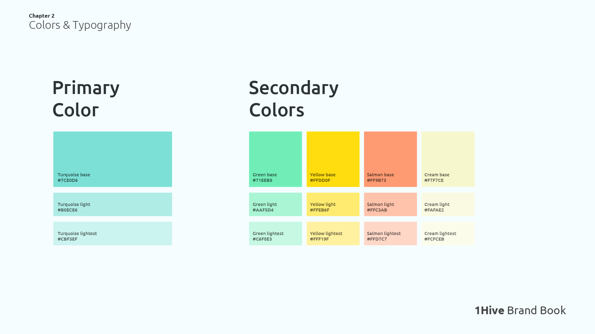
For some time now, these are the established colors in the 1Hive ecosystem. They range from the aquatic Turquoise base to the lighter Cream lighest. Despite these being the established colors, there has always been flexibility in the use of colors outside of this initial color palette.
1Hive is characterized by bright colors, but without being strident or distracting. Almost always using pastel tones that are easy to digest for the viewer.
Community Color Palette
I have come to the conclusion that this color palette is rarely used, and that users choose to use their own colors, and that is precisely why I want to propose a reevaluation of the colors. I think it would be an interesting solution to create a much broader color palette, including a wide range of possible colors that can work to solve design problems.
In fact I propose that this color palette could be created by the community, each person could propose a color that they want to be included in the community color palette, and if it meets the 1Hive color standards and there is consensus in the community, it can then be added to the community color palette.
The creation of a community color palette, where the community has the power to choose which colors make up the brand, contributes to the decentralization of the brand. As there is still no list of colors that are optimal to use, I will specify below some recommendations that will help in choosing colors that fit with the 1Hive ecosystem.
Color Recommendation
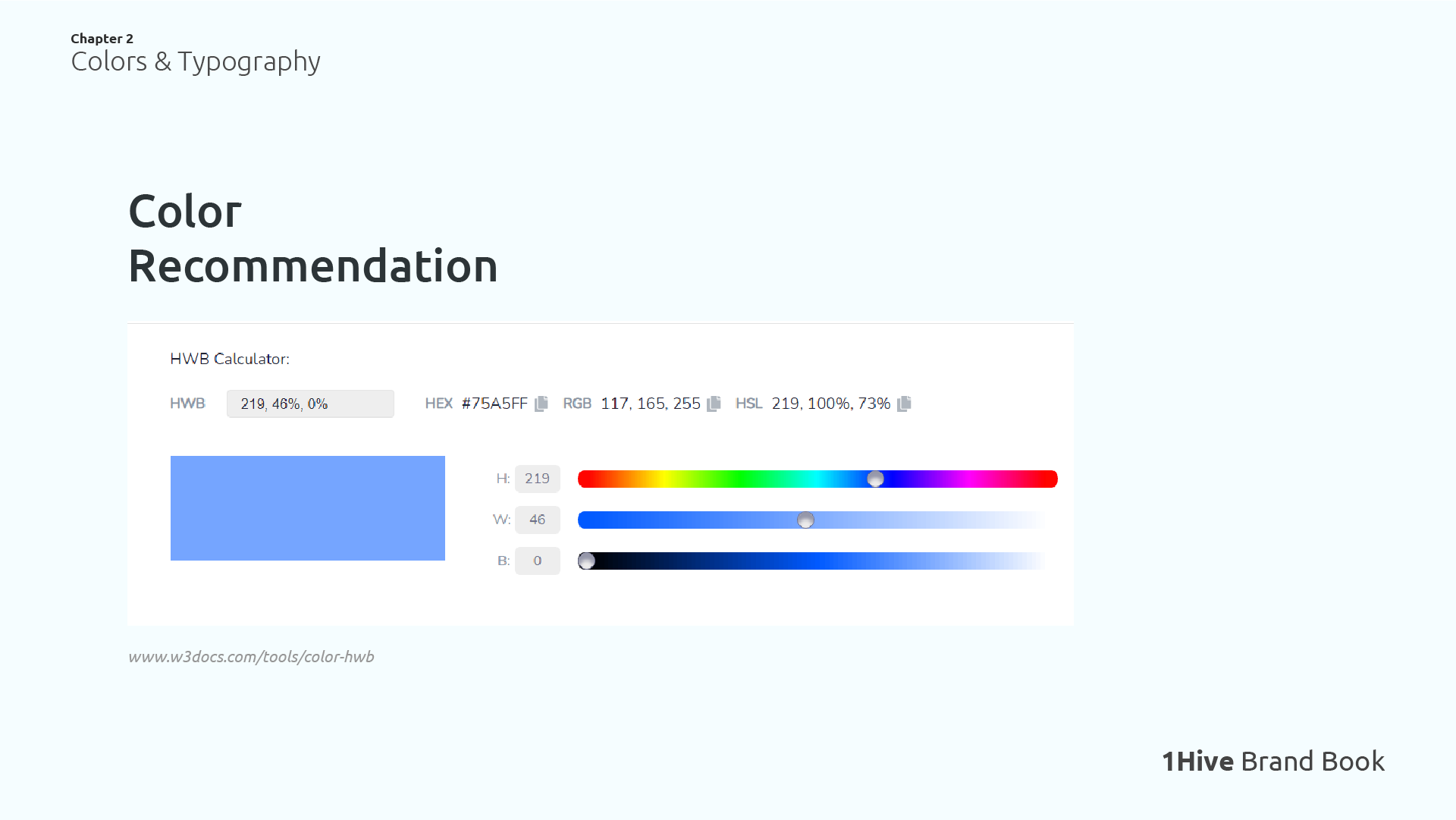
As I mentioned before, the colors used in 1Hive are characterized by being soft and generally pastel in tone, avoiding colors that contain a lot of darkness. That’s why I took the HWB (Hue, Whiteness and Blackness) color standard as the basis for these recommendations.
In HWB to reach the desired colors, you should specify the hue and leave Whiteness and Blackness to zero. It’s quite easy in usage: black is too dark, white is too light. The more black you add, the darker your desired color will be. In case you add as much white as you add black, your final color will appear grey.
The idea is to use Whiteness percentages higher than 40%, and keep Blackness to a minimum. This way you will get pastel colors that fit the 1Hive color standard.
You can use this tool to find colors to use in your designs. Here are some examples of appropriate and inappropriate colors.
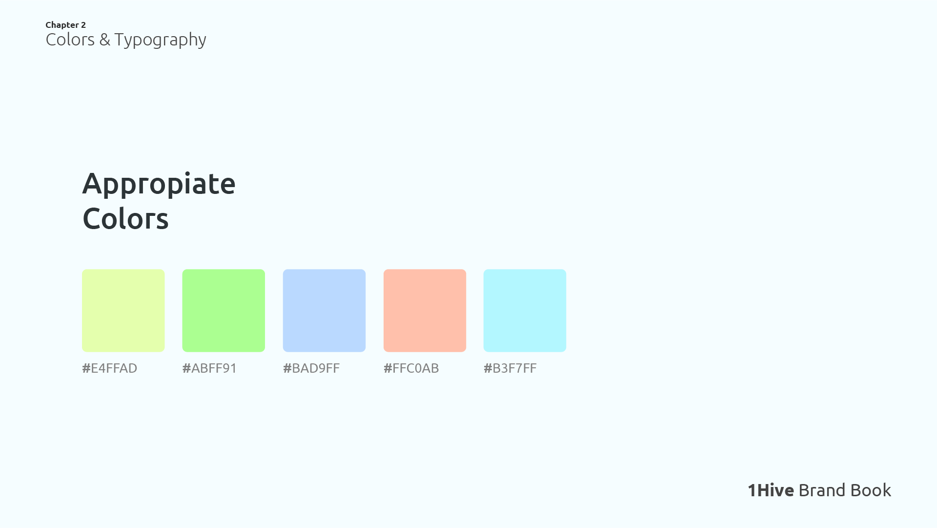
5 Examples of Colors that would fit into a 1Hive Design
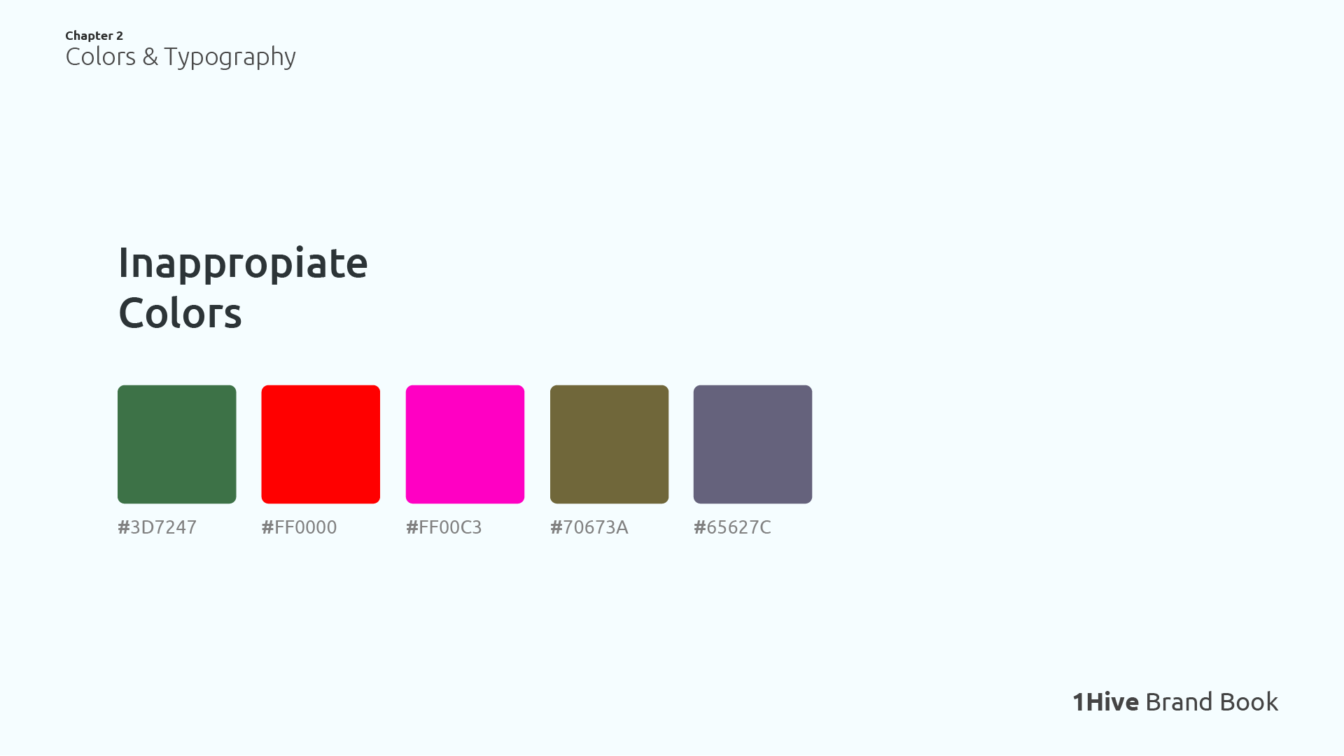
5 Examples of Colors that would not fit into a 1Hive Design
Grey Scale Colors
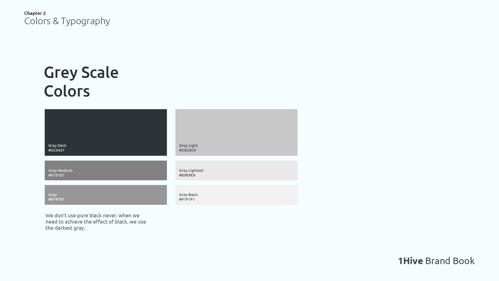
We never use pure black, when we want to achieve a dark effect, we use the color Grey Dark. We also have lighter grays that can be used for secondary typography, subtitles or in any occasion where it is required.
Contrast Ratio

Examples of good contrast (1st and 2nd image), and bad contrast (3rd image).
The WCAG (Web Content Accessibility Guidelines) are a series of recommendations and standards created by the W3C (World Wide Web Consortium) to ensure the accessibility of web page content to all types of people, the standard defines two levels of contrast ratio: AA (minimum contrast) and AAA (enhanced contrast).
To ensure good readability, legibility and accessibility, we must comply with at least the AA level of the WCAG in our texts.
In WCAG 2, contrast is a measure of the difference in perceived “luminance” or brightness between two colors (the phrase “color contrast” is never used). This brightness difference is expressed as a ratio ranging from 1:1 (e.g. white on white) to 21:1 (e.g., black on a white). To give a frame of reference, on a white background:
WCAG 2.0 level AA requires a contrast ratio of at least 4.5:1 for normal text and 3:1 for large text. WCAG 2.1 requires a contrast ratio of at least 3:1 for graphics and user interface components (such as form input borders).
Large text is defined as 14 point (typically 18.66px) and bold or larger, or 18 point (typically 24px) or larger.
We must ensure that our visual content is legible and accessible to all people. Avoiding combinations with low contrast that result in illegible text. Here is a website where you can check the contrast between two colors: Colors Contrast Checker
Color Accessibility
Red/Green color blindness (Deuteranopia) is the most common type of color blindness. Therefore, I propose that to improve the accessibility of messages, we should always accompany green/red icons/images with descriptive text to help the user distinguish the message being communicated.
Typography Basics
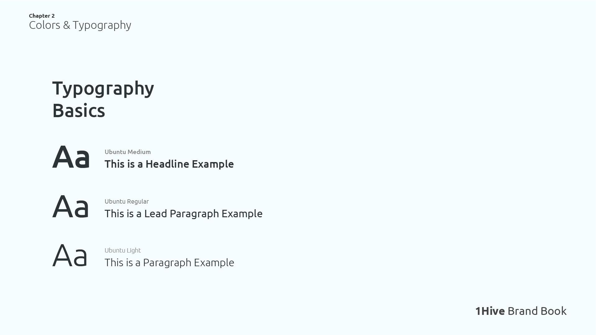
Ubuntu is the official font used in 1Hive, it is important to learn how to use its different weights in order to emphasize important words, differentiate headlines from paragraphs, etc.
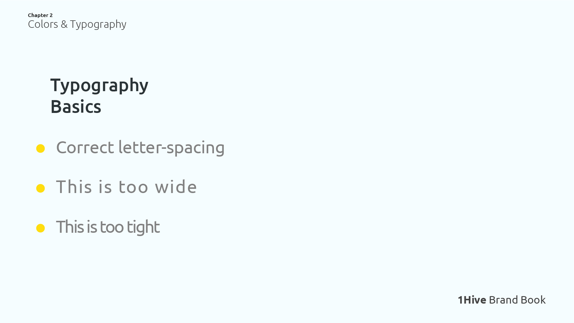
We must also take into account the spacing we leave in our texts, let’s try to maintain the maximum readability by using a correct spacing, not too tight, not too wide.
Logo Typography
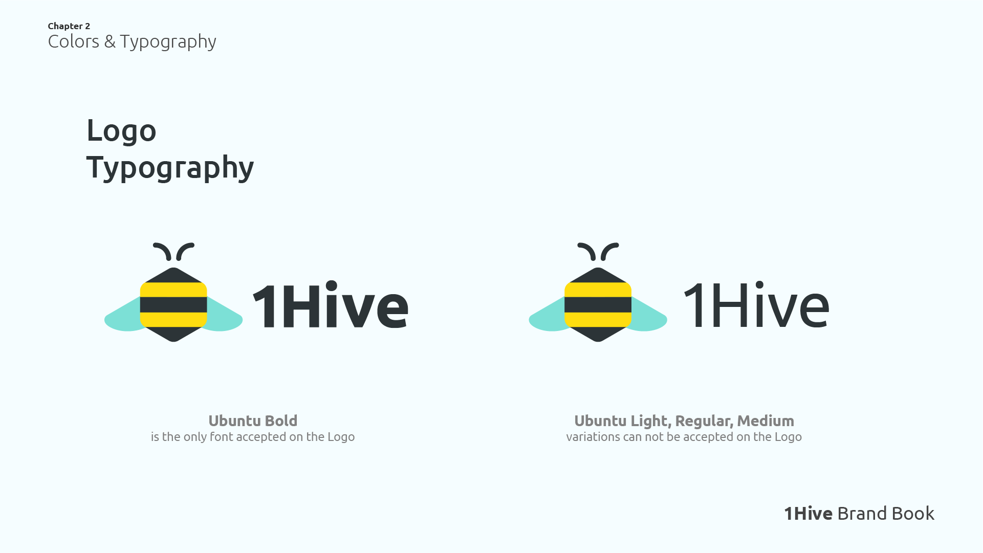
The text accompanying the bee in the 1Hive logo must be Ubuntu Bold, weight variations Light, Regular, Medium, etc… will not be accepted as a valid logo, and are considered as a misapplication.


 Thank you for this very useful information , is an accurate guide to properly use colors and fonts!
