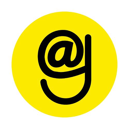
Here’s my token ticker and design entry. I actually did it before the Agave change came through but it doesn’t matter. My proposed Ticker choice remains AAGE.
TICKER Rationale:
"Holders become people of the aages.” We are saying we are holdling for the long run - without saying it. That’s a hard trick to pull off, now satisfied by associating the ticker with Time as well as the most commonly spoken vowel sound "Ay"or “eɪ”.
The design concept:
The Aage token has been created to offer a more stable future for HNY holders. It is a timeless performer, built to enhance the existing infrastructure we built and invested in on xDai, not to rally off a quick alt coin season pump.
The tail of the g also mirrors the shape of an inevitable, exponentially upward pump that AAGE Coin will see, another exciting buzz that is trigger associated with seeing the upward, exponential tail shape daily in the icon on your screen.
The geometry communicates support between AAGE and HNY, in that: the tail of the ‘g’ hangs off the ‘@’, and the ‘g’ creates a cradle of support to catch the HNY comb should it fall from where it hangs.
The @ symbol symbolizes the source of WHERE the value is AT, crafted by the builders that fly around and around its centre (the bees). (@ is the hive that lets the honey drizzle down its tail (being the tail of the ‘g’). I can see some good letter animation content coming from its potential uses for social media 8 second videos.
The colour yellow:
The icon is bright, (yes) it reminds you of Rariable (that’s cheekily intentional) and yet I will have a hard time believing that you won’t remember this coin if it was airdropped in your wallet, or viewed in a drop down list of icons! Therefore, it is distinctively memorable.
It actually also marries almost perfectly to the colour of the 1Hive’s own new NFT on xDai, if you look at that logo, so the themes are flowing with the yellow.
The colour Yellow is associated with the feeling of abundance, working to achieve a material desire and confidence over one’s ability to sustain the long haul…. (through the aages… ok Ill stop now, you get it.)
This yellow is also Native to the gold colour used in the HNY colour pallet, yet distinctively different by being more potent, bolder and stronger in RICHNESS.
The striking, boldness in this icon is meant to communicate its ability to stand out in the minds of the buyer and create a STRONG and FEARLESS safety net for our investors so that HNY holders are not exposed to as much financial risk.
Ironically, in Yoga ‘energy’ philosophy, the colour yellow governs the solar plexus and is concerned with taking action, fears and reassurance about being fed.
The design counter-markets any potentially perceived weakness and lack of assurance that HNY could be exposed to, by affirming the ‘yellow feeling’ as an association of legitimate confidence for the customer, towards the AAGE protocol and securing the attainment of the investors desire to earn.
This is why the design remains simple, yet complements an agenda to attract more individuals and institutional investors, wanting low-risk, optimal assurance.
Anyone informed about supply circulation, currently looking at HNY without AAGE would see a potential weakness by comparison to other exchanges alone, (like 1inch without Chi) so this design amplifies that feeling of security, which AAGE is intended for.
Closing remark:
In terms of marketing, my Design Ego doesn’t like the truth that up and down shapes and web based symbols will always win over the subconscious minds of our honey buyers and influence them to choose honey to invest in, as the front runner for the internet innovations of the future…. …for aages.
This is how I would play this move.
Thanks for your time, considering this entry 


 Late Submission Please Head Back To
 Contest Ended
  Ticker: $AGVE

 and want to thank everyone for your support!