Updates to make 1Hive homepage more useful

Hello, I wonder if/how the main 1hive.org page could be re-done?

When someone gets curious and visits 1hive, all they see is the price (useful), common pool (mystery), token supply (useful) and ‘active’ (another mystery, even to seasoned hivers).

  • There is no top menu and no further explanation whatsoever about xDai, about 1hive, about HNY, just a list of proposals that won’t make any sense to a new visitor.
  • If you try to connect your wallet (which will be on ETH main) you get an error without any helpful info on how to add xdai network etc.
    Basically we are chasing people away, which cannot be intentional?

Some ideas, but open to others:
1- Make a top menu with links to About, Team, Forum, proposals, FAQ, Tokenomics ->

2- Either explain or remove the ‘common pool’ and ‘active’ numbers, or move them to a separate ‘tokenomics’ page with deeper explanation.

3- Move the proposals from the front page, add them to the Proposals page.

4- Add a complete new section on the home page, briefly explaining xDai, 1Hive and HNY, with links to more detailed explanation.

5- Add info/tooltip to the ‘connect wallet’ button, with either a brief explanation or a link to a full explanation about how to add xDai network to MetaMask etc.

More later, input welcome!

11 Likes

I think all these ideas would improve the over all experience on the website. I agree that it is confusing at first and may turn people away. I remember how I felt scrambling to buy my first honey. I missed the $50 honey because I was intimidated and confused in the beginning of my journey here. Information on the site, regarding everything described above, is something I would support.

1 Like

Are you aware of https://about.1hive.org ? All of the things you’ve suggested already exist, just on a different place in the domain. I agree it would be useful to link to this more clearly somewhere though.

3 Likes

I am aware now but wasn’t in the beginning when I was looking for any information I could read. I eventually found these sub domains but not with ease. A simple drop down in the header with about, forum, faucet, farm, dex, ect. may be very helpful to new comers seeking info and help them navigate our resources.

3 Likes

Totally never saw this site until I read about it in your post.

Let’s look to why? There are 4 key links on that about page.

  1. https://faucet.1hive.org/#/
  2. https://honeyswap.org/#/swap
  3. https://info.honeyswap.org/ link to docs takes one to …https://about.1hive.org/docs/honeyswap/
  4. https://1hive.org/#/

The only one that even has a link to the above is the info.honeyswap.org and this one while there and findable is somewhat hidden under ‘docs’. Which I would have thought would be docs - for honeyswap and not 1Hive.

Look at the above key links and as far as I can tell there is no consistent high level menu that has the key links to 1Hive. I want to point out I am not ‘mad’ or bitching here I am just pointing this out, because I had the same experience with Maker and suggested some time ago that they make a kind of global menu bar that every sub-domain or approved Maker site (where users DO Maker stuff on) or documentation, etc. HAVE.

I see this lack of high level organization throughout the DAO landscape, Maker, /r/ethtrader on reddit, sourceCred, and 1Hive so it isn’t like this is just a 1Hive problem. It is a DAO bootstrapping legacy where anyone works on stuff but no-one is really guiding a higher level experience, vision and unifying the information and access experience for users.

This literally is the result of the ‘bizarre’ model of development being applied to DAO’s. Linux documentation and standardization as far as I can tell took a good 5-10 years to put together. Fortunately the operating system itself helped, and the user only needed to download a package and install it - there were no linux ‘dapps’ or ‘defi’ there were just software packages, drivers, etc. to install and these generally would use the operating system itself to fill out the documentation available in man pages etc. We have no such formalized operating system that DAOs could structure themselves within that could provide the higher level organizational characteristics (like an operating system) to focus ‘bizarre’ community development into one of a number of forms of ‘cathedral’ organizational features access and documentation.

Literally one can look at a DAO as a kind of software package for users - our problem is that we have no concept of an operating system (crypto/defi) that unifies this functionality in terms of standardized I/O ports, drivers, protocol services (so any service using a particular protocol is interoperable), etc.

1Hive doesn’t need to solve what I see as a growing problem in this space (just like I saw it as a growing problem in the opensource community at the time) but it simply needs to put some organizational order to the chaos.

I do think this is an open problem in the space RIPE for a new approach. In effect unifying not just what we do in the crypto/defi space, but how it is done, and how it is all presented to the operator/user.

4 Likes

The Honey Pot interface (https://1hive.org) is currently being rethinked and will be more useful when v2 hits.

Maybe someone who is working on the v2 version of Honey Pot can add some information in this thread so the feedback can be directed at v2 instead of the (soon obsolete) v1? @rperez89

2 Likes

You have to keep in mind that we never announced anything. 1hive was stumbled upon before we were ready, and end-user documentation and the like were in the pipeline but were not prioritized because the other things were not entirely up to the standard we wanted them to be at. I don’t think it’s fair criticizing in this manner when it was already thought of and planned, but had to be pushed back because we had a massive influx of people who wanted to use what we had built before we were comfortable sharing it ourselves.

I hope you don’t see what I’m saying here as some sort of attack - I just want to make it clear that we are well aware of the shortcomings on documentation and linkability between our projects, and that we absolutely want to put focus on a good user experience, as we want to build products and tools that are useful to people who do not a lot of experience in the crypto space.

Before we migrated to xDai our priorities were a bit different than they are now, and the sites we had and documentation we had was becoming outdated, so we scrapped most of it to make way for something better, which just didn’t happen in time. We could never have predicted this massive influx of interested people :slight_smile:

7 Likes

@Harry I think you suggestions make a lot of sense!

Yes, we are currently working on the V2 for honeypot.
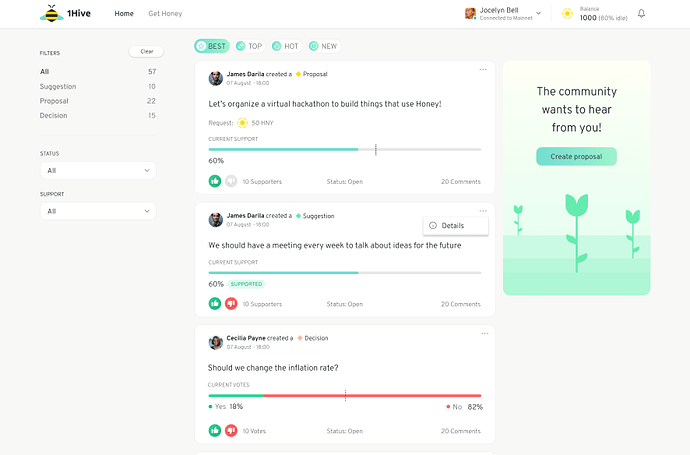
A sneak peek:

This merges current proposals as well as administrative votes.
Proposal that request funds (Proposals)
Signaling proposals (Suggestions)
Administrative votes (Decisions)

We’ll take all this ideas into consideration! As a start we should definitely add more useful links to the top header

11 Likes

Ah just wanted to quickly pop in and say this looks incredible!

2 Likes

Thanks @fabriv, that already looks a lot better. Though I still think the proposals etc should not the main focus of the site, but maybe the page you shared would be an internal one?

I have worked with many devs in different roles and know it is hard to step back, take off the ‘insider glasses’ and view a project/site through the eyes of someone who might be interested but doesn’t know anything about it.

The proposals are interesting for those already deeply involved. Newcomers likely just want to know how to get verified and claim the faucet and that’s ok, we must cater to that. But even relative newcomers like myself need an easy way to learn about the different parts of the project and an easy navigation and ditto explanation.

Let me know if you want me to preview/test any new interface/site before it’s live.

2 Likes

@Jasper Actually I do remember seeing it, but could not remember where (likely somewhere on discord) and as far as I know there is no direct link from the homepage.

If the homepage is not explanatory and clear enough, then newcomers won’t ever enter Discord and even if they do, they will have a hard part finding the link to the about page they needed in the first place in order to get interested enough to join the discussion :slight_smile:

2 Likes

that looks awesome, nice and clean design

1 Like

Actually, the biggest improvement could be made very simply by swapping 2 (sub) domains:

The page currently living at https://about.1hive.org/ should be https://1hive.org/ and current https://1hive.org/ should move to https://dao.1hive.org/

Then we still would need to add some other bits to the current about page (ticker etc) and a better menu to the dao subdomain, but at least the main info could be found easily, the site can be shared/promoted online etc.

3 Likes

Next step would be to merge most if not all of these as most is redundant and (linked to) in different places:

I could start that project, but it would be a decent effort needed. Still: better now than later, when all of the above pages will have expanded and some might contain contradicting/outdated info, better to have one main Knowledge Base to refer to.

1 Like

Wow, that looks amazing.

1 Like

Had considered that as well, and I think it may make sense in the short-term but maybe not in the long term. My mental model for this is sort of like reddit.com versus http://about.reddit.com. There is information about the community/organization.

1 Like

Yes, I agree that in the longer term it will likely no longer be needed. But it easy to remove bits and pieces that will likely be clear even to first-time visitors once the project has wider traction. For now, I think we should do as much effort as possible to draw people in and keep them in.

Also: there should still be a separate ‘About’ page anyway with more detailed backgrounds, the homepage should just have some brief info and a link to the detailed subpages.

2 Likes

Now that’s an interface befitting of the Hive :star_struck: I’ll like to help anyway i can although i don’t know any coding or technical stuff. Amazing work, it will be glorious when it debuts :chart_with_upwards_trend:

Looks very good :slight_smile:

Between BEST, TOP, HOT, and NEW, would you say having the NEW list as default is best? This way we can avoid burying potentially great proposals under other more popular ones.

2 Likes

Really nice design! :trophy: :1st_place_medal: