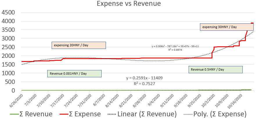
UPDATE - Revenue is back calculated to be revenue = (all inflows - bootstrap of 5000 - minting. The dandelion votes are a cause for the revenue step changes. Most of these were refunded so this graph needs to be updated to reflect that.
UPDATE 2 - luigy pointed out that some of the issuance were paid back because they were initial payments for dandelion votes that the community voted were required (these were removed from both cancelled out by the income and expense side).
I suspect it would be pretty cool to have one of these types of graphs built into a tokenomics live analysis page. Maybe on Honeypot. Someone from the design team I suspect could make these look a lot nicer.
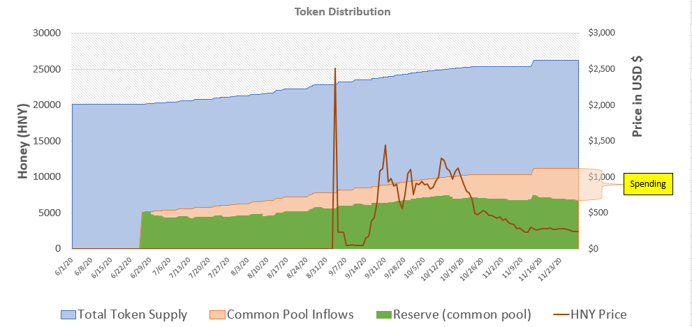
Our expense has picked up a bit here in the last few weeks.