So here I am again, with brand-related stuff about Celeste.
First of all, apologies for all this comes and goes!
You are aware that we choose the current logo with a poll, I think it was nice to do it because getting feedback and know the opinions of the community are always good, but from a designer’s point of view, I don’t think that’s the best way to choose a logo.
When I saw the current logo at https://celeste-dashboard.vercel.app/#/dashboard it just didn’t feel right. I was debating whether to say it or not, but in the end, I couldn’t help it and need to speak up, although the design was mine, it doesn’t look good and it doesn’t reflect Celeste as I believe it should. I’m not going to bore you with the technical details, just say that this logo lacks personality and does not work well in all applications, the more I see it, the more I find mistakes in it, a brand should not produce that.
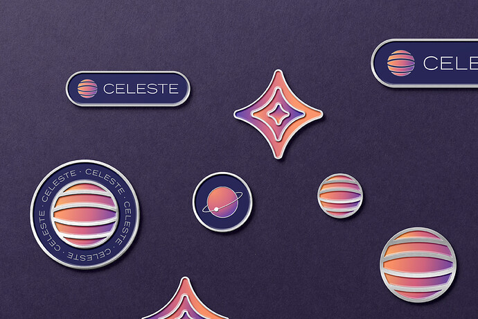
Celeste identity went through many comings and goings, at the beginning we even thought to use the Greek oracle as a concept, then when we decided to use the connection between all living beings, the earth and space, the logo that I´m showing you in this post is the one I created.
I think that as designers, we need to find the balance between satisfying the needs of the client (which in this case at the beginning was Celeste swarm, we weren’t even such a big community when we started working on this) and what we think will work better taking into account more technical aspects. I think what happened to me was that I tipped the scales more to the client’s side and I didn’t defend the reasons and concepts that were behind this logo, I wanted to the team felt really pleased with the identity, so I create other options but those options didn’t feel right and that was counterproductive because not only did I wear myself out, but I wear out everyone, so sorry for that again! all this comes and goes are my fault 
This logo involves space elements and a celestial body, it has an expansion wave that represents a supernova exploding.
The supernova concept is interesting because:
- When a supernova explodes it forms new stars and planets.
- The crucial elements needed for life—Carbon, oxygen, nitrogen—are made from the interior of a star. Therefore, ingredients that comprise the human body originated inside of stars.
All this is really related to what we were discussing about the connection of all the elements in the earth with the space and the celestial bodies, the universe as once, the relation of 1Hive and Celeste.
I envision these pins in real life and think that I would really love to use them.
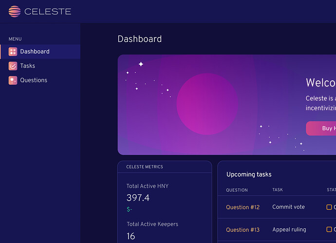
This is how it looks on the dark mode that I am currently working on
I hope you understand this and don’t feel that I just decide to take the time that you invest in the voting and your comments and just throw it all away, I appreciate your time and efforts and I think I really learn from this experience.
Thanks to the team for understanding me and for the support on this, I really appreciate that too!


