1Hive Brand Book Chapter One: Logos
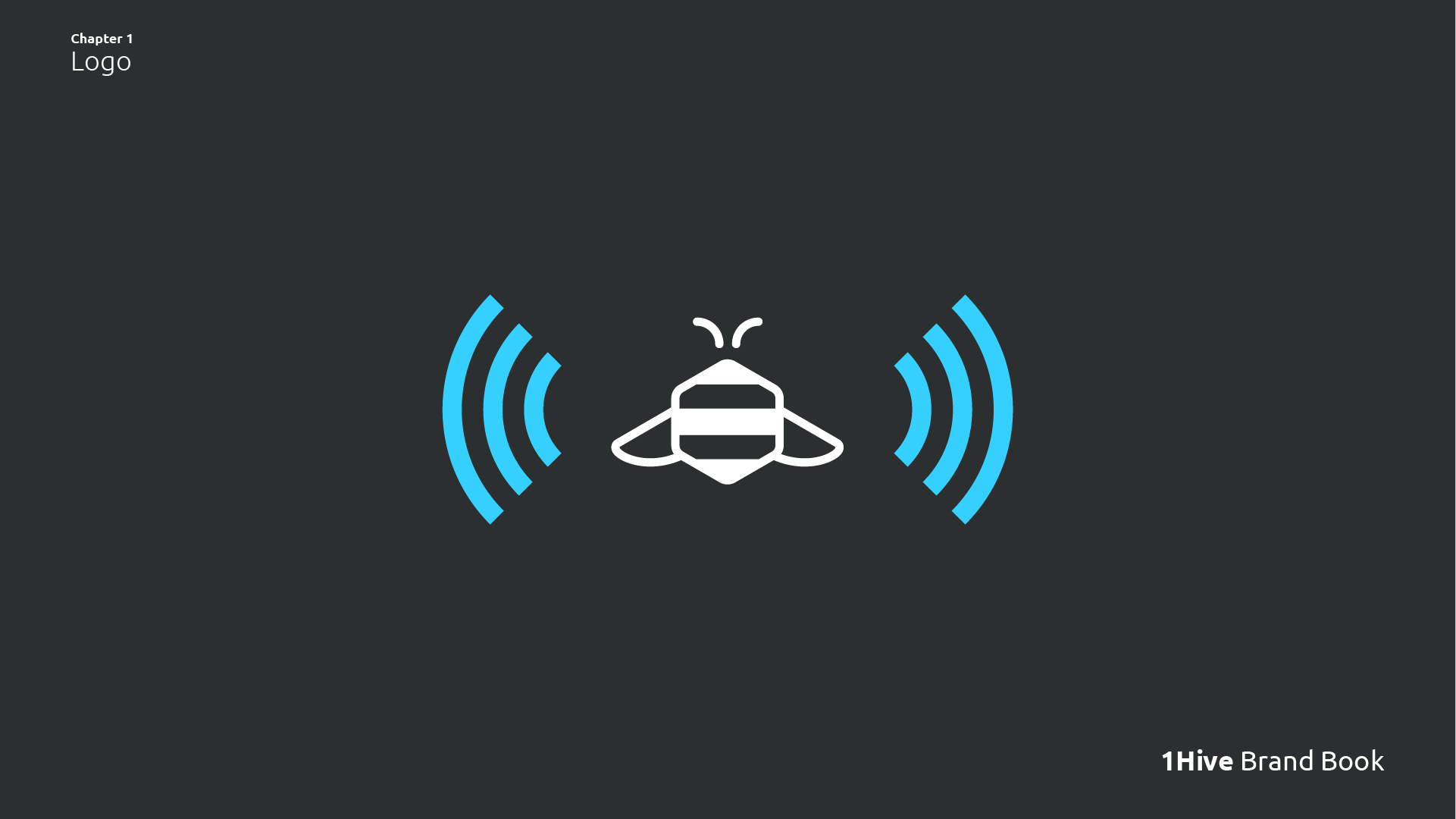
Visual representation of where the measurements were taken to establish the clearspace in the logo.
Introduction 
Hey 1Hive, I know it’s been a while, but you know how they say “better late than never”. To keep the feedback flowing and also keep the community in the loop, I’ve been thinking of making this a weekly thing where each week I show a draft of the chapter I’ve been working on, I’d love to hear your thoughts on this. I appreciate as much feedback as possible from the community so that in the end I can deliver a product that we are all happy with.
So without further ado. Welcome to the first update of the 1Hive Brand Book, in this chapter we will focus on the 1Hive logo, some basic applications, the ways you should use it, and good practices to keep in mind.
Clearspace 
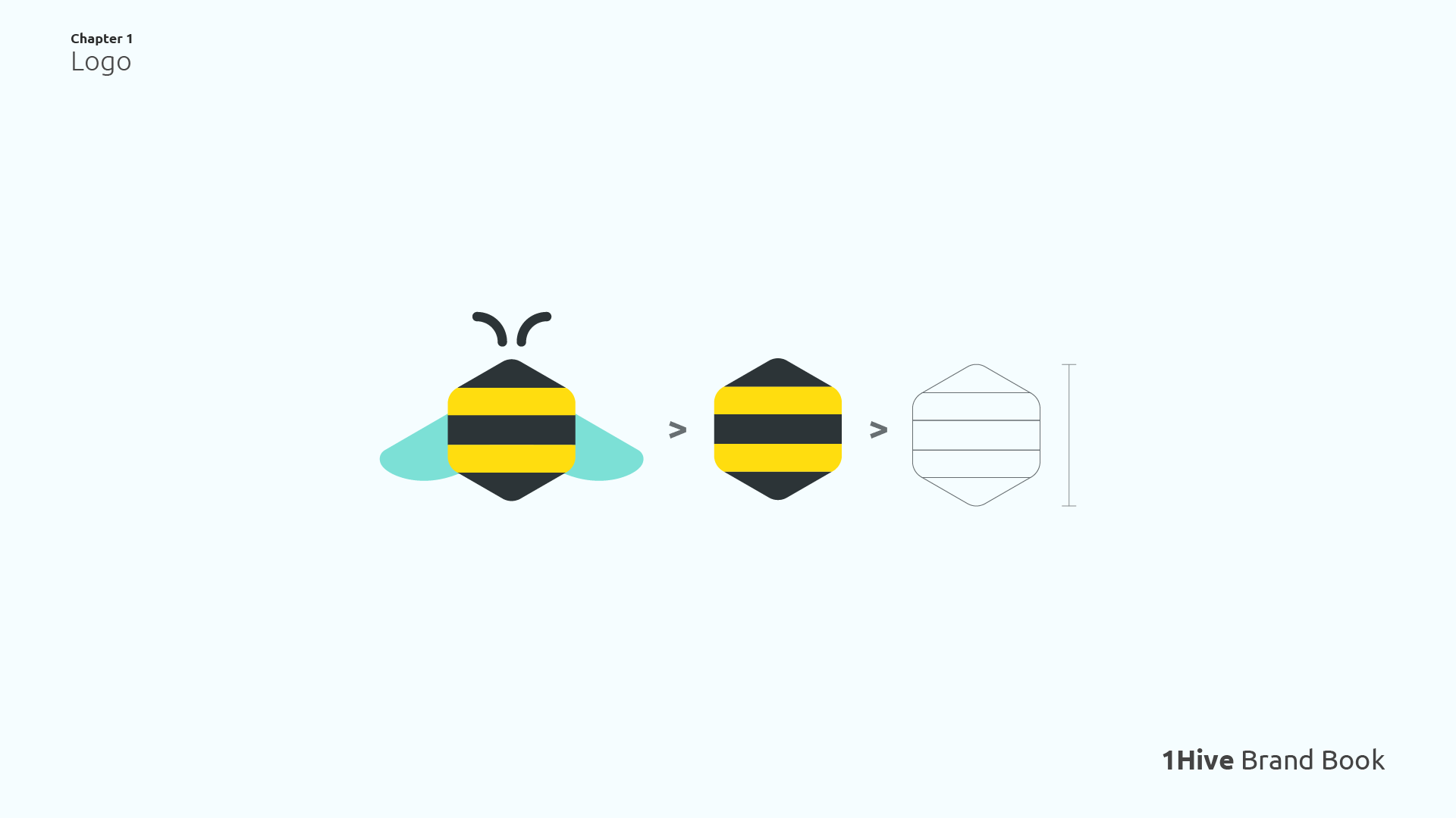
A logo must have room to breathe, we must give it space so that it can stand out and be noticed. That is why it is so important to establish a clearspace for it. Clearspace is the term used for the amount of white space around the logo, where no element interferes. It ensures that our logo is easily recognizable, visible, consistent and creates impact.
To create the clearspace of the logo, I took the main body of the bee (as this is the most consistent element of the whole logo), discarding the wings and antenna, and based on the vertical height of this to establish an x (bee vertical height x bee vertical height).
The clearspace of the logo equals 1/2x around the entire logo. This x is used throughout the document, as well as its smaller size variations (1/2x, 1/4x, etc…). And it is used to set the necessary distances.
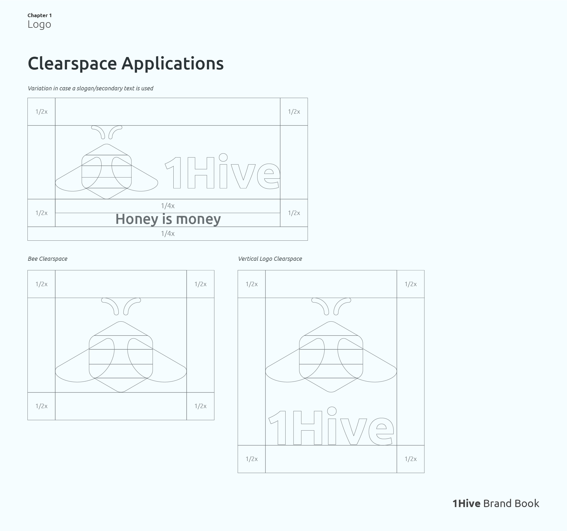
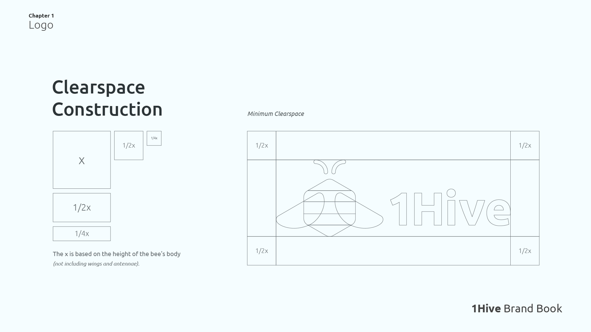
Here is a demonstration of how the clearspace would be applied to different variations of the logo. We always keep the same proportion in all logo variations, except when we construct icons / avatars for social networks, where the margins are a little smaller, as we will see below…
Social Media Icon Construction 
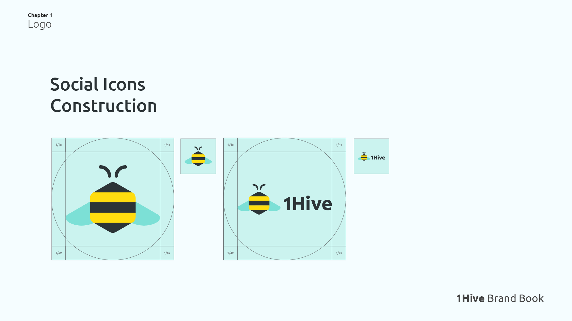
Social media is all about exposure, the way we show our image to the world is vital, that’s why I want our logo to have the most prominence possible, and this is achieved by giving it more real-estate within the icon, in this case we only use a 1/4x margin, so we make sure the bee shines in any format, be it square or circular.
Logo Usage in Partnerships 

And it’s not all about our logo, we must also try to give enough space to the logos that accompany the bee, so we create a sense of balance and harmony between the two.
We use at least two 1/2x blocks to separate the images, although it can be more if desired (of course, without exaggerating).
Logo Colors 
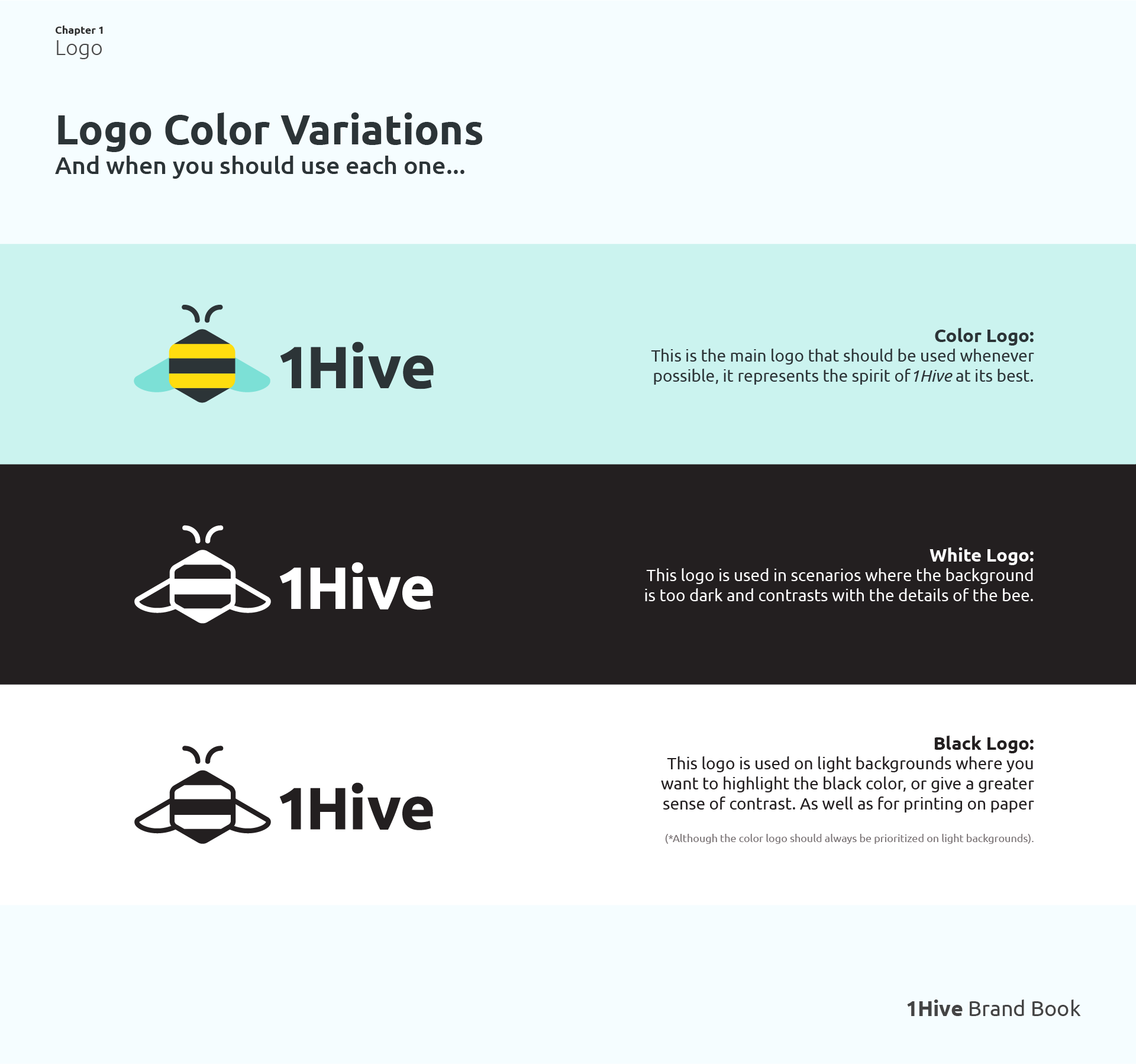
Here we find our beloved bee in the classic and iconic color scheme of yellow, dark gray and light blue. This is the logo that represents 1Hive as a whole, and is the one I recommend to use whenever possible.
But it is not always possible, so we also have alternatives in monochromatic version that help us to solve design problems when the background we use does not complement the original color palette. An example is the white logo, which we use precisely when we work on such a dark background that we lose the contrast with the details of the bee.
The black logo is a little more special, since we should almost-always opt for the color logo on light-colored backgrounds, we can use this one in occasions where we want to highlight the black color, or also in applications on white paper where we have to print in black ink.
Dont’s 
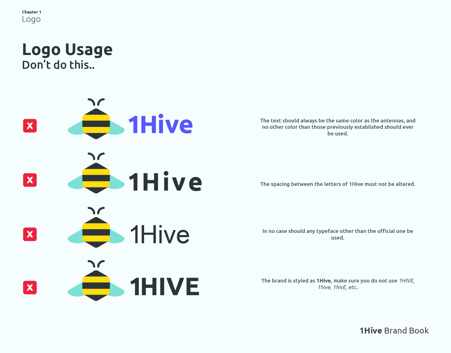
In this section I take care to highlight some of the bad practices, things you should definitely not do when working with the 1Hive logo, do not try to manipulate or alter the logo, if you want to maintain consistency between all the designs, always try to work with the original files.
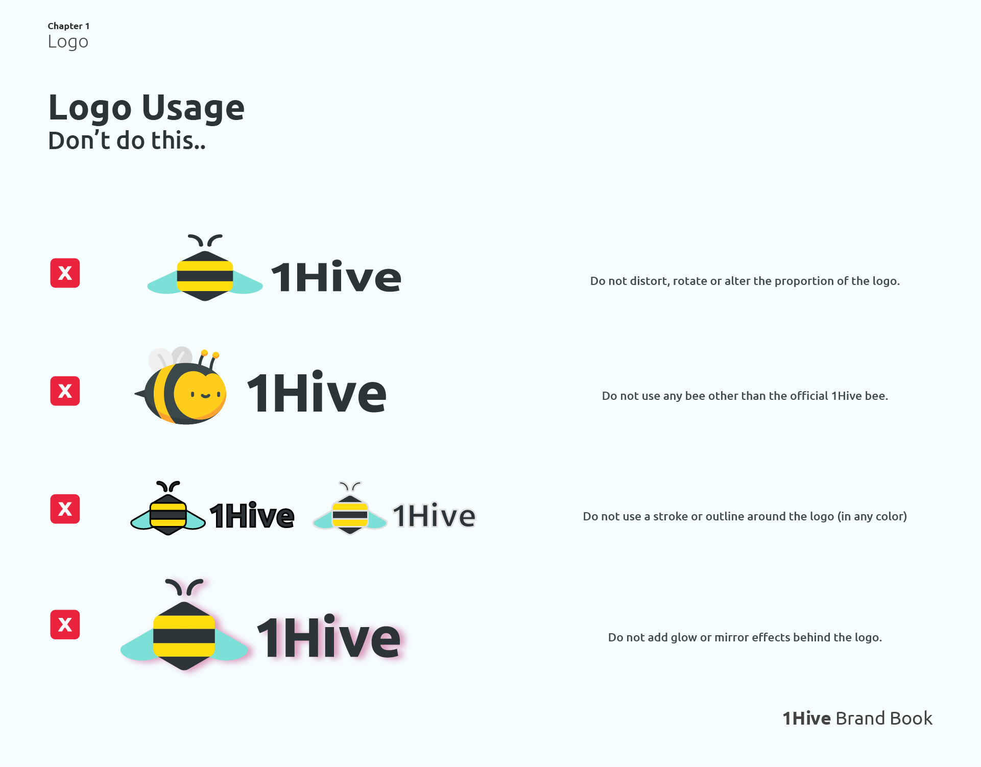
I want to emphasize that these are just some of the ways in which you can alter the image of our logo, and give it a wrong application, when the brand-book is finished, I will be much more explicit. But for now I think it is enough to give you an idea of the most common alterations that are usually committed.
Audio Logo 
While browsing the forum, I came across a quite interesting proposal from @harsh24 that I think fits quite well with 1Hive’s branding and I would love to implement it.
Having a Jingle, Audio Logo, or Sound Branding leads people to connect much more with the brand. Something that seems so simple at first glance but can have a really big impact on us. *(Who doesn’t remember the iconic Windows XP power on and off sounds?)
This begs the question: What would our Audio Logo look like? What do we hear when we think of 1Hive? surely something to do with bees obviously. Here are some ideas that users shared in the forum post and I found interesting.
The bee’s name? 
The bee is an essential part of the 1Hive ecosystem, it has been with us for all this time, and that made me think…why don’t we give a name to the characteristic bee in our logo? I think it would be interesting as well as Agave has Alvin, I think we should also name our own mascot, I want to know what you guys think about this 
See You In The Next Update
It has been a pleasure to share the process with the community, and I hope next week to show a little more about the next chapters of the Brand Book (Colors, Typography, Tone Of Voice,…).
Before I finish I want to make it clear that the results I present here are not final and are subject to change, we are working on everything as we go along, and as I mentioned before, I want the guidelines to be flexible and I want the community to feel free to comment on anything they think should be added, removed, etc.
Peace 
 I will try think up some good names and post back here.
