🌞 [POLL]Which logo should we use for Celeste?

When we started to think about the concepts and terminologies for our version of The Court, it was a real challenge to think about how it will be related to the concepts that we already had for 1Hive.
We needed to find appropriate terms and concepts since Celeste will play a major role in helping the community to regulate the different proposals in a more democratic and fair way.

The idea of using the name Celeste :sun_with_face: and the terminology related to celestial bodies came from focusing on the relationship of living beings with the world that surrounds them, of the idea that we are all part of a universe :sparkles: that sometimes escapes from our understanding, but where we know that we play an important role and that we can make a difference with our actions. The relationship of something as small as a bee :honeybee: can be with something as vast as the celestial bodies, which govern what happens on Earth. The idea of going from the chaotic to the orderly, from the unbalanced to the balanced, from the smallest as an insect is to something as big as the universe.

Having said all that and after putting you into context, we wanted to ask the community for help so that we can all choose the identity that will represent Celeste through this poll.

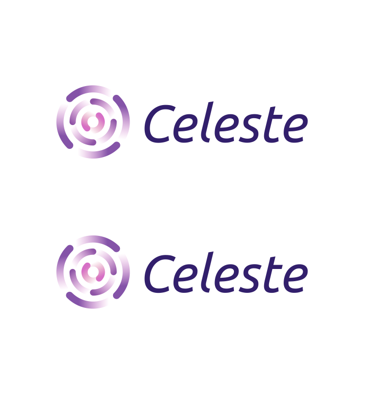
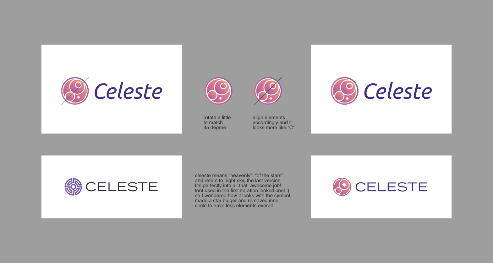
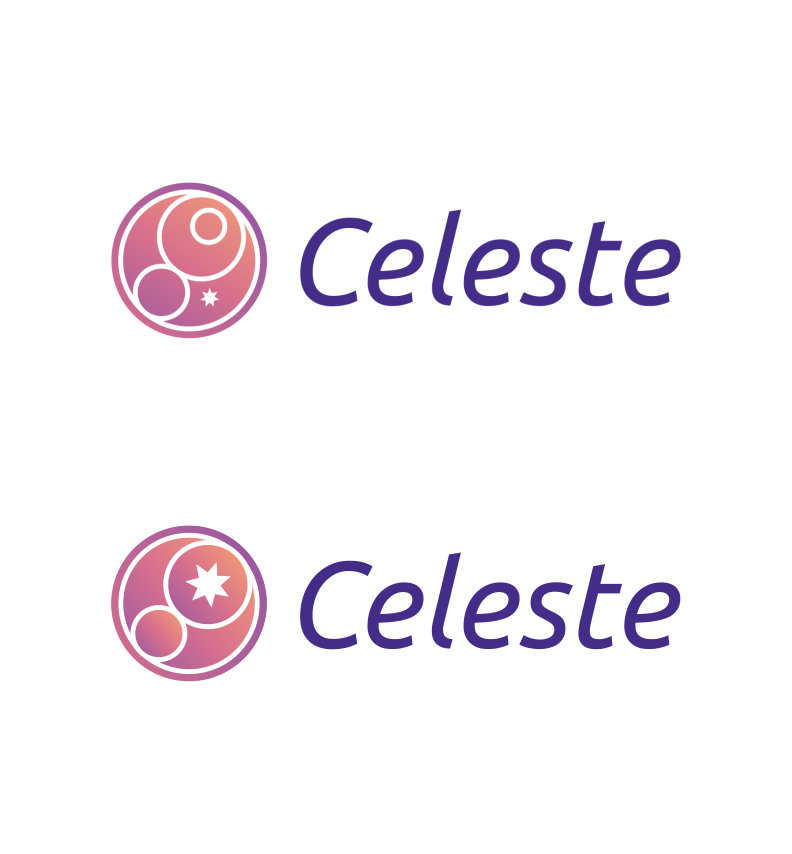
Here you can find the figma file with three different options and some side notes so you can understand the ideas and concepts behind each logo, after you check it, please come back and choose the option that you feel it suits better for Celeste.

Celeste Logo poll
  • Option 1
  • Option 2
  • Option 3

0 voters

Thank you very much for reading this and for particpating in this poll!

22 Likes

:smiley: cool stuff :heart:
3 looks good to me, can we change the colors to yellow ?

2 Likes

Love the simplicity of option 1!

1 Like

All the options looking good, but I personally like 3rd the best.

1 Like

Its a no brainer, option 2 does it for me. Not only does the yellow resonate with the 1Hive, honey and bee concept, but the name celeste no doubt agrees with the sunlike design(celestial). Also just like the sun, celeste is fair and does not discriminate, it shines on all things and is what connects everything and sustains it, just like our celeste!!

2 Likes

In my opinion who Iam looking at all 3 options on figma for me best option is 1st option for implementation on celeset.

1 Like

I like option 3 the best, then option 1 then 2
Option 1 kinda reminds me of a “round table” like knights of the round table sitting round deciding things like a court.

But I think option 3 is the cleanest, nicest looking design and also is somewhat celestial with the stars.

Option 2 is fine and a nice design but I prefer the others. Great work on all 3

1 Like

very nice job. everything looks nice, i’m choosing n3 but would be happy no matter what will be chosen

1 Like

For me option 1 does it - As a designer myself I can see how the logo fits a narrative that goes very much in hand with what the whole project is about. The others dabble a bit more with fantasy-related themes - I’m not saying this is bad but I think it’s not really something the brand should pursue.

On another note, I can see how this branding could make the product work for other communities that would happen to have a similar environment to 1hive. Are there any benefits to having the branding of celeste similar to that of 1hive? I feel like this could be limiting and imo the more differentiation we can have between each of the DAO’s projects’ brandings the better. That goes without mentioning the subtle design decisions that make this option stick to that of 1hive’s without being too much on your face about the fact that this is a project being worked upon by that same community, this aspect I liked a lot.

4 Likes

I like option 3 and voted for it… but sadly it should probably be rejected cause it looks like a sideways crazy guy with 1 eye open and his lips puckered…

I did a test… and it cannot be unseen.

4 Likes

image

story checks out

1 Like

Awesome job on the logos @fioreb! :star_struck: Really liked the 1st and the 3rd options.
The 2nd is a little too pointy for 1hive i think, as 1hive branding suggests that graphics should be calm and more on the rounded side. :nerd_face: I’d also like to note that I’m a fan of your work and what you do for 1hive :blush:

As a designer, i love to discuss branding and all thinks design lol. So i made a little notes with suggestions on what i think should make the logos even more amazing! And want to hear what you all think about it.

Option 1. This one is perfect already, but is there any reasons that elements are turned to the left side or counterclockwise? I think it will be more natural if we go clockwise. Looks almost the same, but i think it will be more on the positive narrative/going forward type of stuff which could be beneficial for the project :blush: Here is the preview:

Option 3. I love how it resonates on the whole celestial spirit and creates strong interconnection with the project name. I have some suggestions on this one, which i wrote into this picture:

Removed 1 element and placed a star there, alligned elements to 45 degree, made a star bigger. This is what it looks like in comparison:

These are just some ideas on the logo that i think could be beneficial for the identity. Voted for 1st option bc it’s cool :grin:

4 Likes

Yes, I feel the same way that you about the first option Pab! I think it fits better and is more subtly related to the theme, I feel that the last one is more explicit.
For me, it also connotes something mystical, a concept that I find interesting to exploit in Celeste identity.

In my opinion, related to what you mention in the second paragraph each community should take Celeste and the honeypot site and give a reskinning of them that suits better the identity of each community, similar to what we did in 1Hive in that time, we took Aragon’s work and gave a reskinning that suits better for 1Hive. I agree with you and I like it too the idea that Celeste it has concepts behind it that relate it to 1Hive, but that it can work independently as a brand and can be used by other communities without changing anything.

1 Like

I didn’t saw it when you said it but with the body that @cryptoclip add it, I see it too.
I already preferred option 1 without having seen that :sweat_smile:

1 Like

Thanks for those recommendations!! they are really helpful, I didn’t realize that when I was working on it, but yes if we turn the elements to the other side it will subtly connote that is going forward instead of backward.

For option 3 yes I think we should rearrange the elements, the rotation of 45 degrees works! I’m not sure about making the star bigger, I didn’t want to give so much prominence to the star and make that it was the first thing that was seen when looking at the logo, I wanted the logo to be perceived as a whole. With the big star I think it’s the first thing you see and then the rest of the composition.

Now I’m worried about the face that appears there.

Related to the font I really like the idea of using something really different, but when I share it with the team, they felt it was a typeface for a corporate company and we didn’t want to convey that.

3 Likes

Option 3 reminded me of crop circles, so it might be better suitable for the farms :slight_smile:

Option 2 is quite generic and not special enough for what it embodies

Option 1 is what I like best.

2 Likes

Option 1 and option 3 were very hard for me to choose between, i would be happy with either or :slight_smile: Since I was forced to vote for only one, i had to go with option 3 as i felt it was more unique. Looks great!

1 Like

I originally thought option 3 but I think it’s too complex, especially at smaller sizes. The detail could get lost amongst other images.

Considering @borisblock’s suggestion, using clockwise facing I favour option 1. Option 1 could also be animated quite nicely.

3 Likes

I think the first logo can represent nested information spaces and how Celeste provides a projection of reality into the blockchain.

2 Likes

I really like number one the best, visually and conceptually. It was a tough choice though because #3 also grabbed my attention, very unique and represents 1hive well imo. 2 was just, eh to me lol.

2 Likes